The evolution of Eiichiro Oda’s style through the years, from the beginning of the One Piece manga to nowdays.
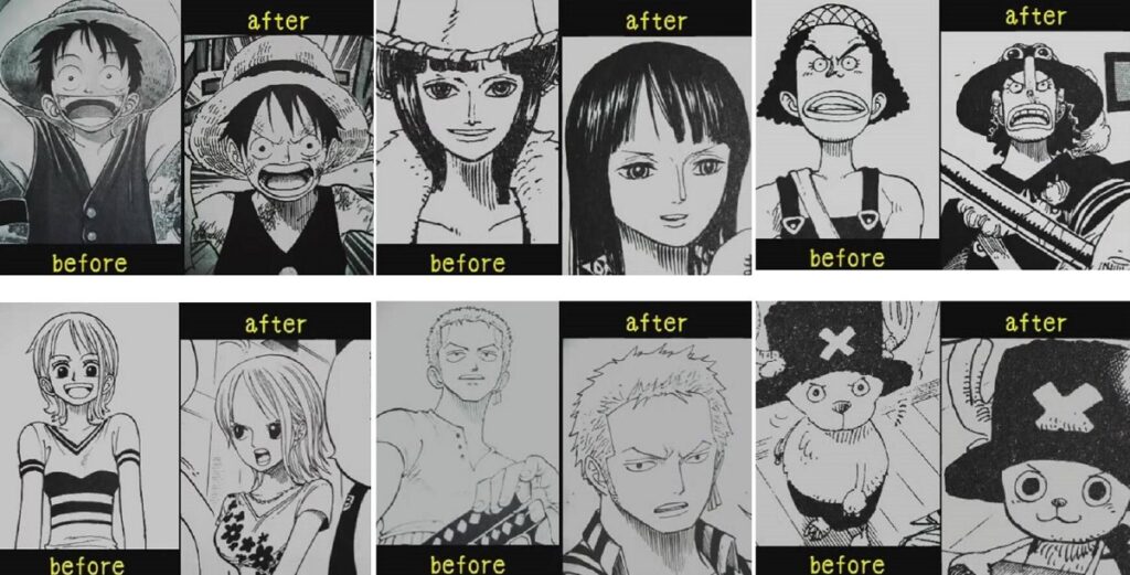
At the start of One Piece Oda was reported as worried about his art style. At the time it was more favored to have big-eyed characters than it was to have the more old fashioned dot-eyed style. One Piece is also noted for its numerous bizarre and extreme character designs, which became more and more common and exaggerated as the series progressed.
One Piece’s distinct style has changed quite a bit over its decade-long run. In the beginning it used many thick lines, giving the art a round, bouncy, cartoon like look. Over time the lines became thinner and crosshatching and line shading is now used extensively.
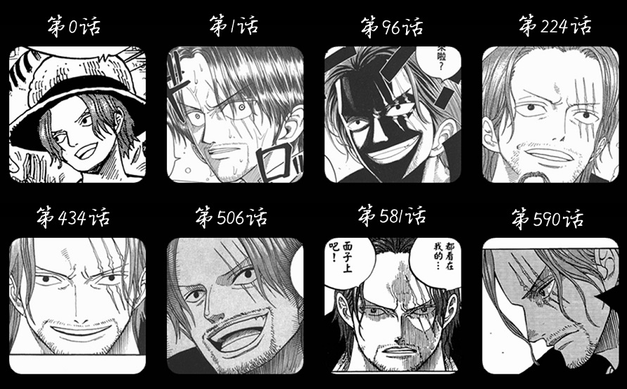
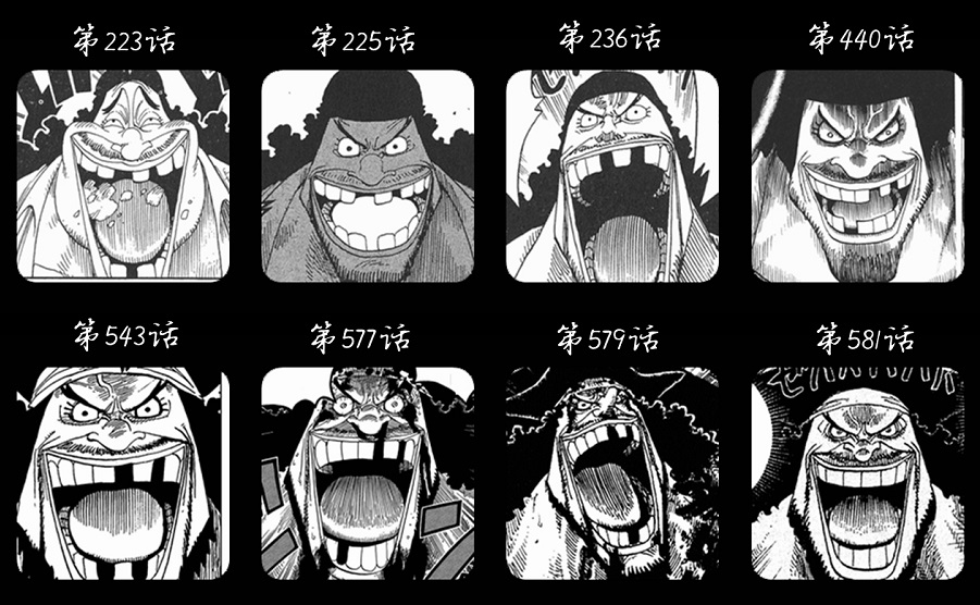
The characters’ features have become more loose to the point where Zoro, for example, can look buffoonish one frame and a hard-boiled swordsman the next. Luffy can appear more grown up at one point before once again becoming more child-like later on. This carries over to many other characters. Chopper did not start out looking as chibi as he does now, though he was always considered cute.
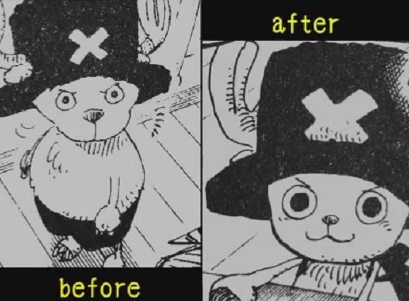
A recent post by a Japanese internet forum user showed the evolution of series’ creator Eiichiro Oda’s artwork by comparing older pictures of the Straw Hat Pirates with more recent ones side-by-side.
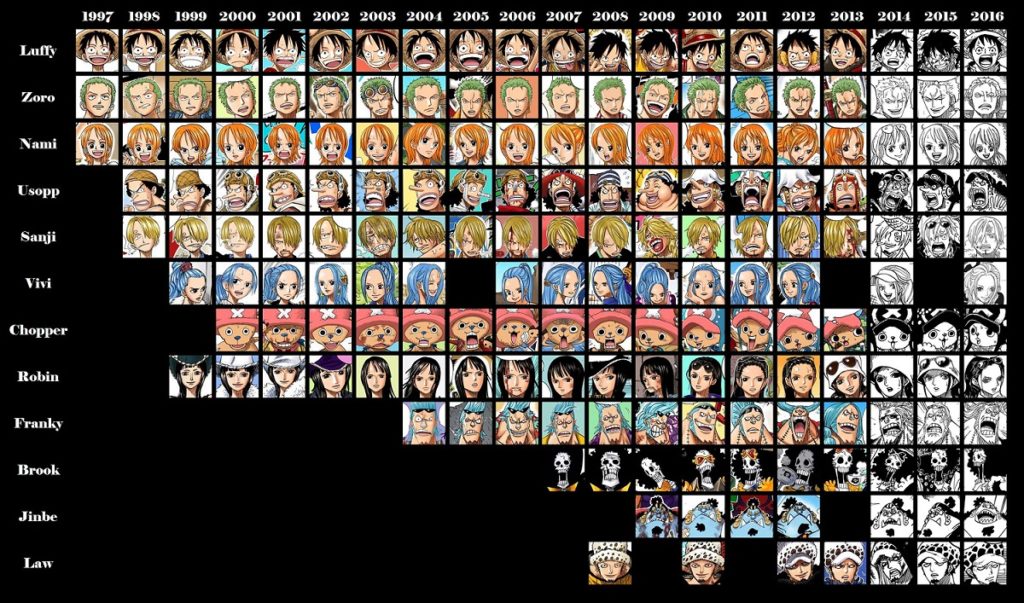
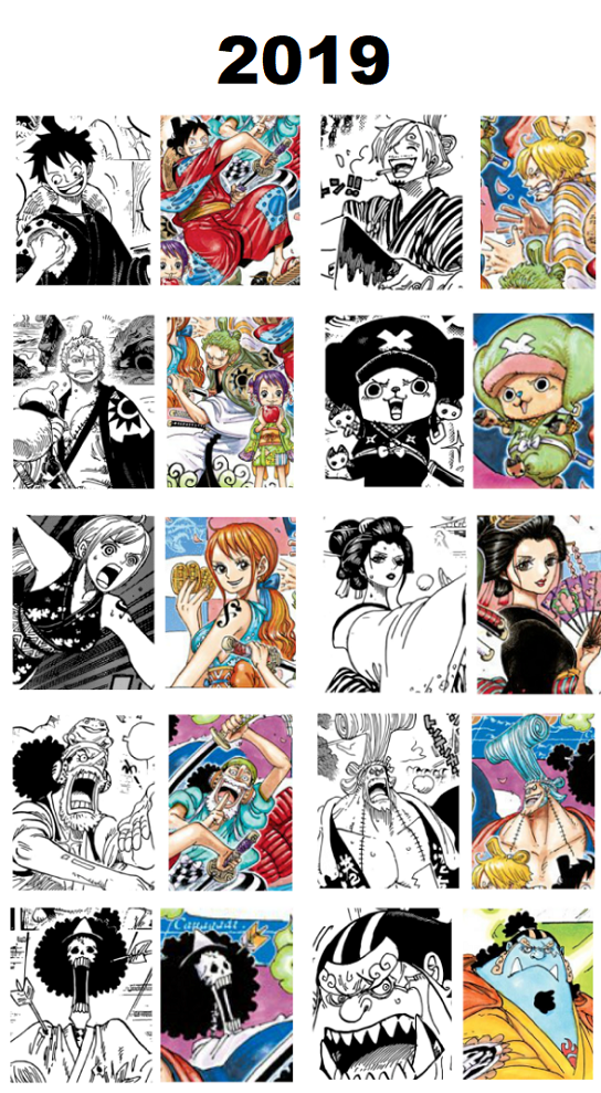
Unlike Part 1, where the art style changed every 100 chapters or so, Part 2 seems more consistent in style. Which style in your opinion best captures the feel of the series? At what point in the One Piece manga did you like the art style the most?
