Why Oda changed Luffy Design
Gear 5 Luffy has a design problem. No, this isn’t edgy vs goofy argument, I’m talking about contrast.
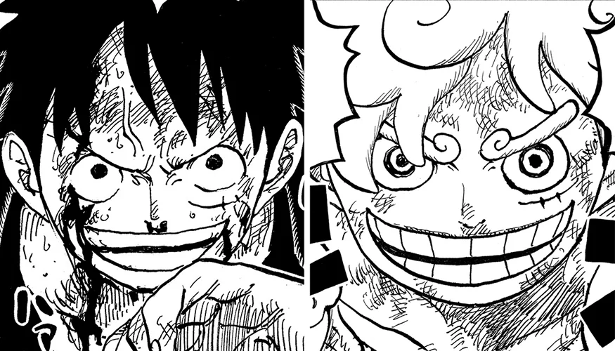
Luffy’s hair & clothes turned white in Gear 5. Hence, removing his signature black hair and red shirt.
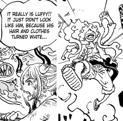
Oda designed most of his character with some black value in them. Including some color-coded white characters like Garp.
He did this so he can put his character in any kind of situation, setting, angle, without obscuring them. His characters will always stand out.
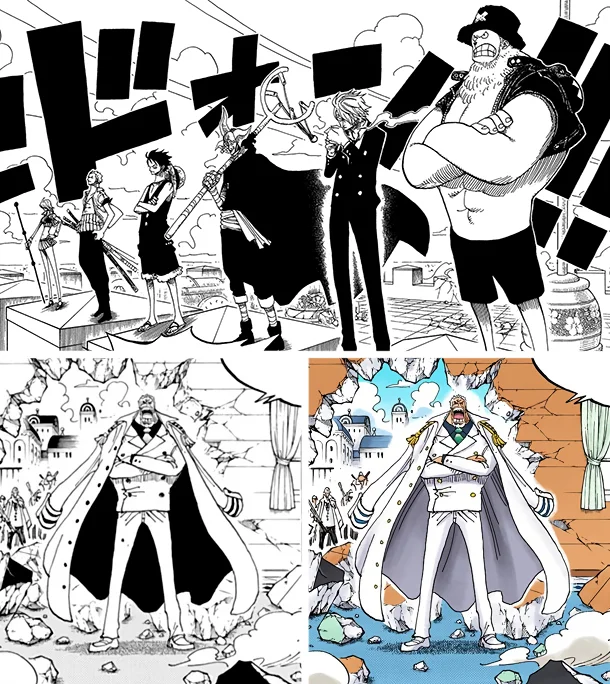
It may sounds obvious since a lot manga did the same. But for One Piece, it his everything. Especially for the main character.
Luffy is small, so does Oda’s paneling, yet the world & his enemies are huge. But thanks to this black value, in every panel Luffy will always grab our attention.
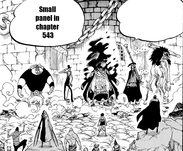
This Gear 5 doesn’t have that. Just look at some of this panels and compared to his normal design. It’s the opposite of what Oda always did.
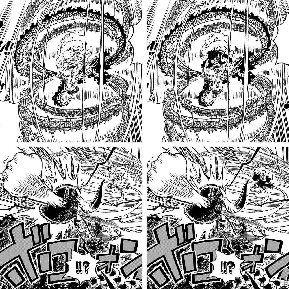
However, I think Oda did this purposely.
The setting
In contrast to Oda’s characters, his background/setting will be mostly white. No matter how detailed it was, it will always compliment the characters.
This time however, the fight takes place in an open night sky (screentone), it’s a great contrast to Gear 5 design.
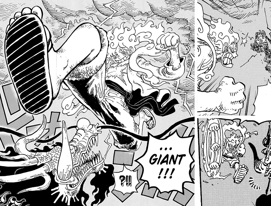
This is why Oda changes Luffy design. From now on his final battles will takes place at night or darker setting.
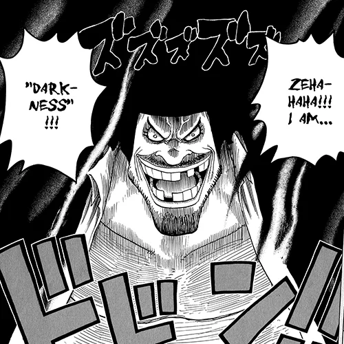
Imagine this Luffy fights Blackbeard with darkness in the background. The darker the setting, the brighter Luffy is. Fitting for someone who will brings the dawn.
Adaptability
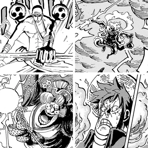
Another angle to look at Gear 5 design is it’s basically a blank canvas. Oda can fills it with ink anywhere he wanted.
Luffy holding a lightning, sparking intense shading on his body. It reminds me with Oda’s old shading pre time skip.
If Luffy still had his usual design, it will looked like this with Oda’s current shading.
*by kapteninsting


